



It's time for a Change
|
Dara: |
Working in jewelry design for a long time, I went through phases of brands with highly decorative and complex themes. When starting WYWN Jewelry back in 2020, I wanted it to feel like a breath of fresh air. Organic, strong yet relaxed forms, with a sprinkle of magical-like elements. The name Wish You Were Naked came out with our clothing capsule and was supposed to reflect that organic feel and simplicity of the first collections. |

|
|
With time, it started to blur with so many alternative minimalistic brands, and with the Alba collection in 2022, featuring pieces inspired by legends, WYWN started to evolve into something else. Freedom, boldness, and daring playfulness mixed with romantic elements became the ongoing Nox series. And the need for a new logo became more and more evident with every year. It no longer reflected my stories or what I wanted to create in the future. |

|
D: |
I've always been extremely awkward when someone asks me to show them my jewelry or tell them its story. I get extremely shy. So, making the branding and design speak for themselves has always been one of my main goals. Meeting with Shaima Moon helped me put it into words and take the first steps towards a change. I told her my story in a raw and vulnerable way, and the result of our collaboration is exactly how I felt it in my heart. And because that is part of Shaima's creative process, I didn't want to speak for her. Instead, I asked her to share her own story of creating the new branding for Wish You Were Naked Jewelry: |
|
SM: |
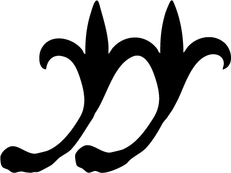
When you’re first introduced to WYWN, you notice how intimate and personal it feels, while still holding a sense of mystery. Dara talks about jewelry as companionship, about wanting to be a knight as a child, and about her fascination with shapes from an old storybook, ancient history or a forgotten world. Everything feels connected to her own world. One thing she said stayed with me: “I want my clients to feel like I’m holding their hand through life's challenges.” It clicked. Jewelry stays close to you, becoming part of the way you move through life. There is a softness to that, but also a sense of protection and grounding. The symbol needed to carry that same feeling: organic and soft, yet bold and strong. Looking at hands and the simple gesture of holding onto someone, I was drawn to the shapes that appear when two similar forms meet, mirror and wrap around each other. The idea of two repeated forms becoming something new became the foundation of the symbol. |

|
|
At the same time, I started playing with the letters WYWN and noticed how similar some of their shapes actually are. But the Y definitely kept standing out. Because the Y stands for YOU in Wish You Were Naked, it felt right to let that shape take the lead. We also looked at historical ornaments and symbols, which brought us back to the fleur-de-lis, a shape that was already part of Dara’s visual world. But instead of using it in its traditional form, I started pulling it apart and letting its shapes merge with what I had already found in WYWN, whilst keeping the outlines loose, as if they were drawn in pen and ink. |

|
|
Slowly, all these ideas started to come together. The two forms stand strong together as they hold onto each other. They might look identical at first, but each one is slightly different, just like every piece of jewelry. The Y still sits at the foundation of the symbol. To me, there is something old about it, without it really belonging to a specific time. It feels like something we created for WYWN, but also like something we could have found somewhere in an old storybook. |
Join the conversation
Read or leave a comment